
Overview
Train tariffs and discounts were one of the most complex parts of the railway booking journey in T-Bank Travel. Users had to navigate different discount conditions, understand which offers were available to them, and figure out how each tariff affected the final ticket price.
I redesigned the tariff experience to make discounts easier to discover, compare, and understand throughout the booking journey — from train search and seat selection to passenger details and checkout.
Results
This project reinforced that discount UX is not just about making savings more prominent. It is about helping users understand the relationship between eligibility, conditions, calculation, and the final price.
A percentage badge can attract attention, but it cannot answer every question a user has. A price can be technically correct at a particular stage, yet still feel unpredictable if the interface does not explain what happens next.
The most important design challenge was to make the booking process feel coherent even when the underlying pricing logic was not immediate or straightforward.
By treating tariffs as a journey-wide experience rather than a collection of separate screens, I aimed to give users a clearer path from discovering a discount to understanding the amount they would ultimately pay.
The core principle behind the redesign: users should not have to guess whether a discount applies, what it means, or when they will know the final price.
01. The challenge
Discounts were difficult to understand and compare
Tariffs affected multiple stages of the train booking flow, but the information users needed was spread across different screens and interactions.
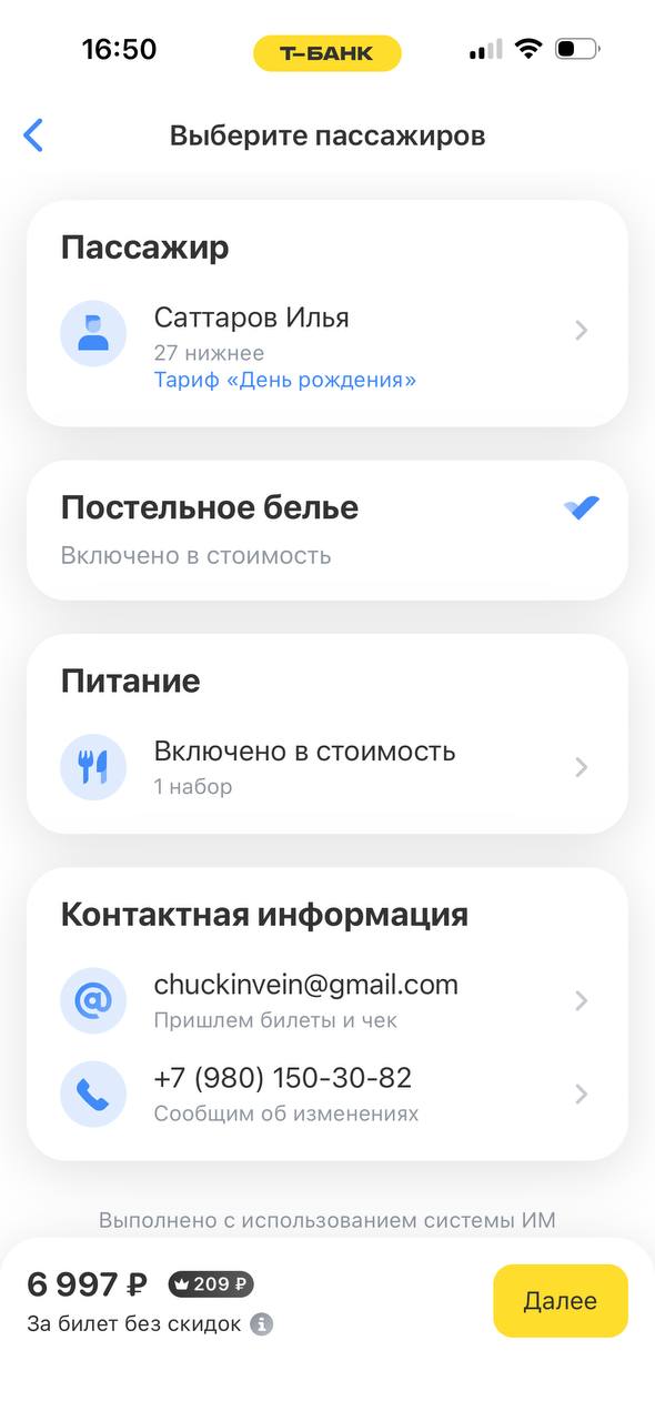
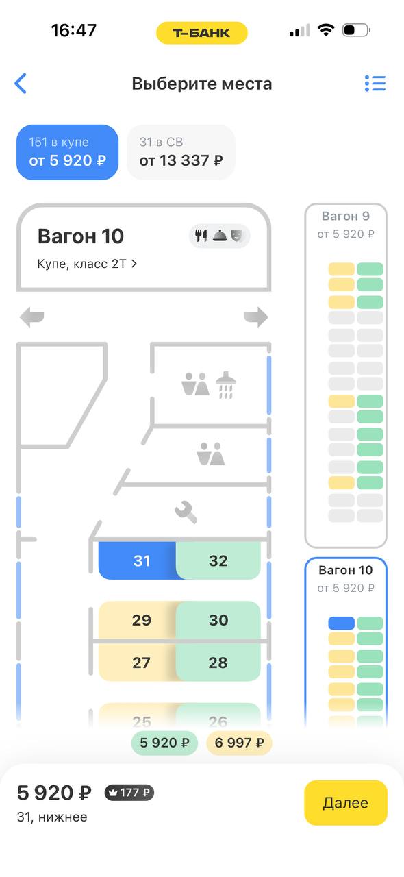
The core problem was not simply that discounts were hard to find. Users also needed to understand whether a discount was available, whether it had already been applied, how much they would save, and when the exact amount would become clear.
This was especially challenging because the system supported two types of discounts:
- Calculable discounts — the price could be recalculated immediately, allowing users to see the effect of a tariff selection.
- Non-calculable discounts — the exact amount depended on passenger information and document validation, so the final discount could only be determined later in the booking flow.
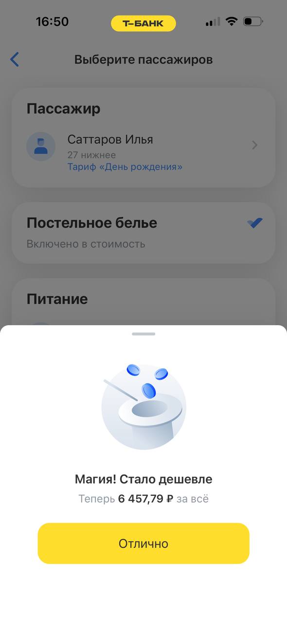
As a result, the same action could produce different pricing behavior depending on the tariff. Without a clear explanation, a delayed price update could be interpreted as an error or as evidence that the discount had not been applied.
The main design question
How might we help users compare available tariffs, understand their discount status, and anticipate the final ticket price — even when the exact discount cannot be calculated immediately?
02. Defining the problem
I approached the redesign around three connected user needs.
Discoverability
Users need to notice available discounts and understand where and how they can select them.
Transparency
Users need to know which discounts are available, which have been applied, and which are still awaiting validation.
Predictability
Users need to understand how discounts affect the ticket price and when the amount shown becomes final.
These needs informed the central hypothesis behind the redesign:
Users will be able to understand the status of each discount and anticipate its impact on the final ticket price, even when the exact amount becomes available only after document validation.
03. Design strategy
Rather than treating tariffs as an isolated screen, I approached them as a continuous experience across the booking journey.
The redesign focused on six principles:
- Make discounts visible earlier in the journey.
- Help users distinguish eligible seats and tariff options.
- Show the financial benefit of a discount more clearly.
- Make tariff selection and switching easier to discover.
- Explain the status of discounts and changes in price.
- Bring tariff and discount information together where users make booking decisions.
The goal was to reduce the amount of interpretation users had to do themselves — without adding unnecessary steps or overwhelming them with information.
04. Key design decisions
1. Reduced disruptive overlays
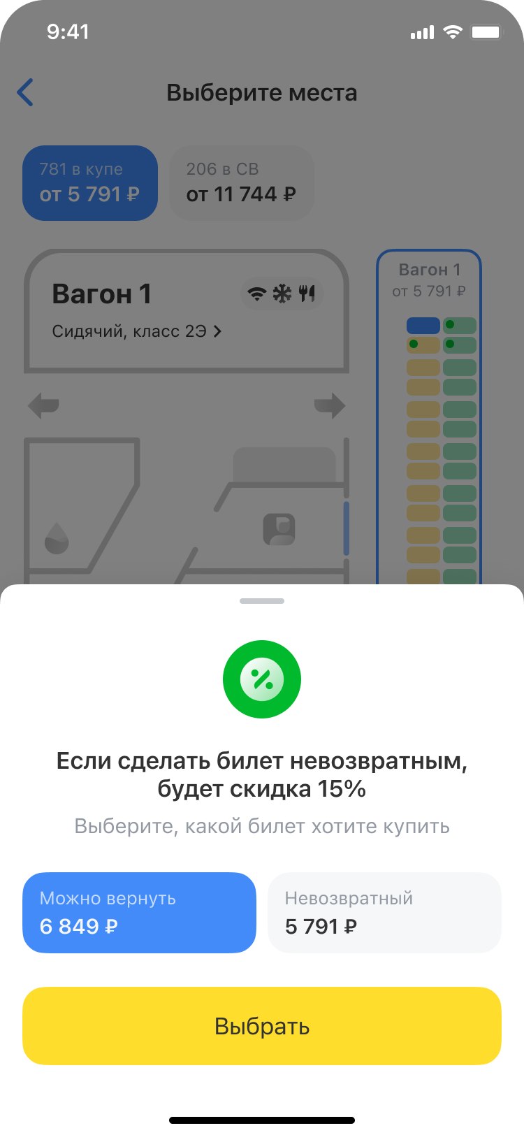
I reconsidered the use of bottom sheets throughout the booking journey. Instead of repeatedly interrupting the main flow, I aimed to keep more relevant information visible in context.
Where overlays remained necessary, I redesigned them to give users more room to review the information and make a decision.
Design intent: Help users understand their options without losing context or feeling pulled away from the booking process.
2. Made non-refundable tickets visible earlier
Non-refundable options can offer a lower price, but users need to understand the conditions before choosing a seat.
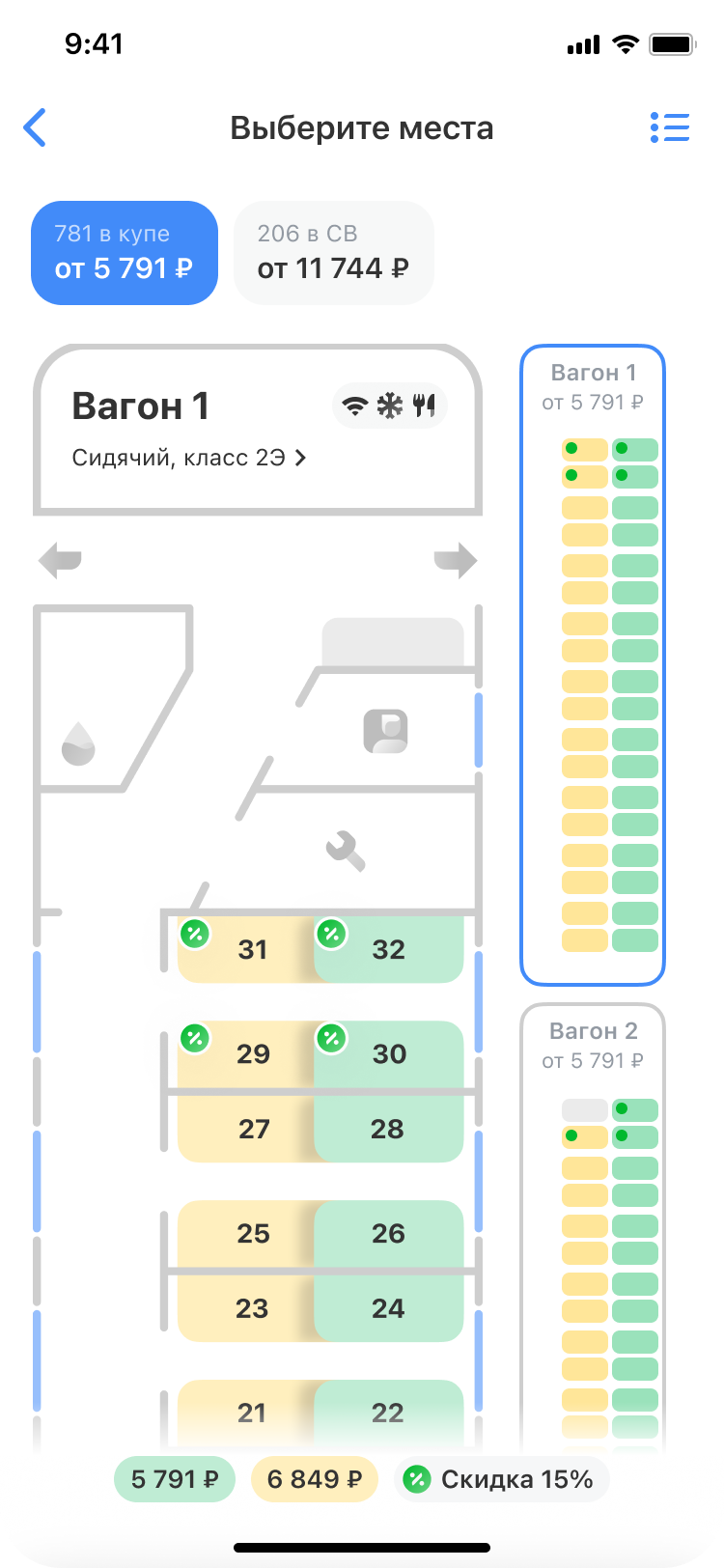
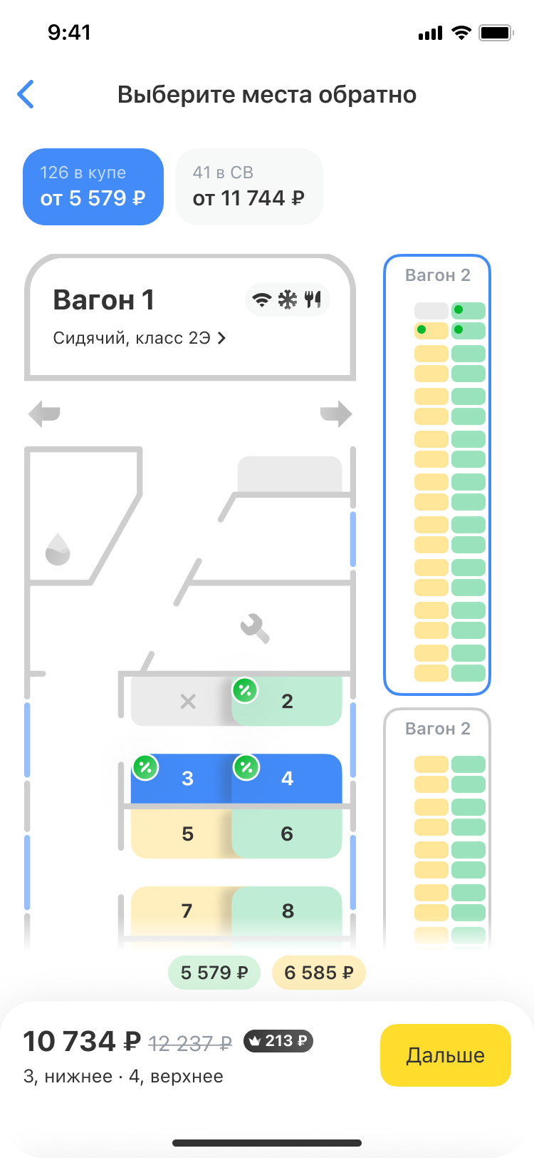
I introduced a more visible way to identify seats available under the non-refundable tariff, using a discount-percentage badge on the seat map.
This created an important design challenge: the badge needed to communicate that the tariff was available for that particular seat, rather than imply that the displayed percentage was necessarily the exact amount the passenger would save.
Design intent: Make discounted options discoverable at the moment users choose their seats, while reducing ambiguity around the meaning of the badge.
3. Made savings more transparent
A discount percentage alone does not always help users understand the actual financial benefit. This is particularly true when the percentage represents a maximum possible discount rather than the amount a specific passenger will receive.
I focused on making the relationship between the original price and the discounted price clearer, so users could better understand how a tariff affected the cost of their ticket.
Design intent: Help users evaluate a discount in terms of its financial impact, rather than relying on a percentage in isolation.
4. Made tariff switching easier to discover
Users should not have to guess whether they can review or change a tariff after making an initial selection.
I improved the visibility of tariff-related actions and worked to make the relationship between a selected tariff, its conditions, and the resulting price easier to understand.
Design intent: Give users more confidence that they can review their choice and select a more suitable option before paying.
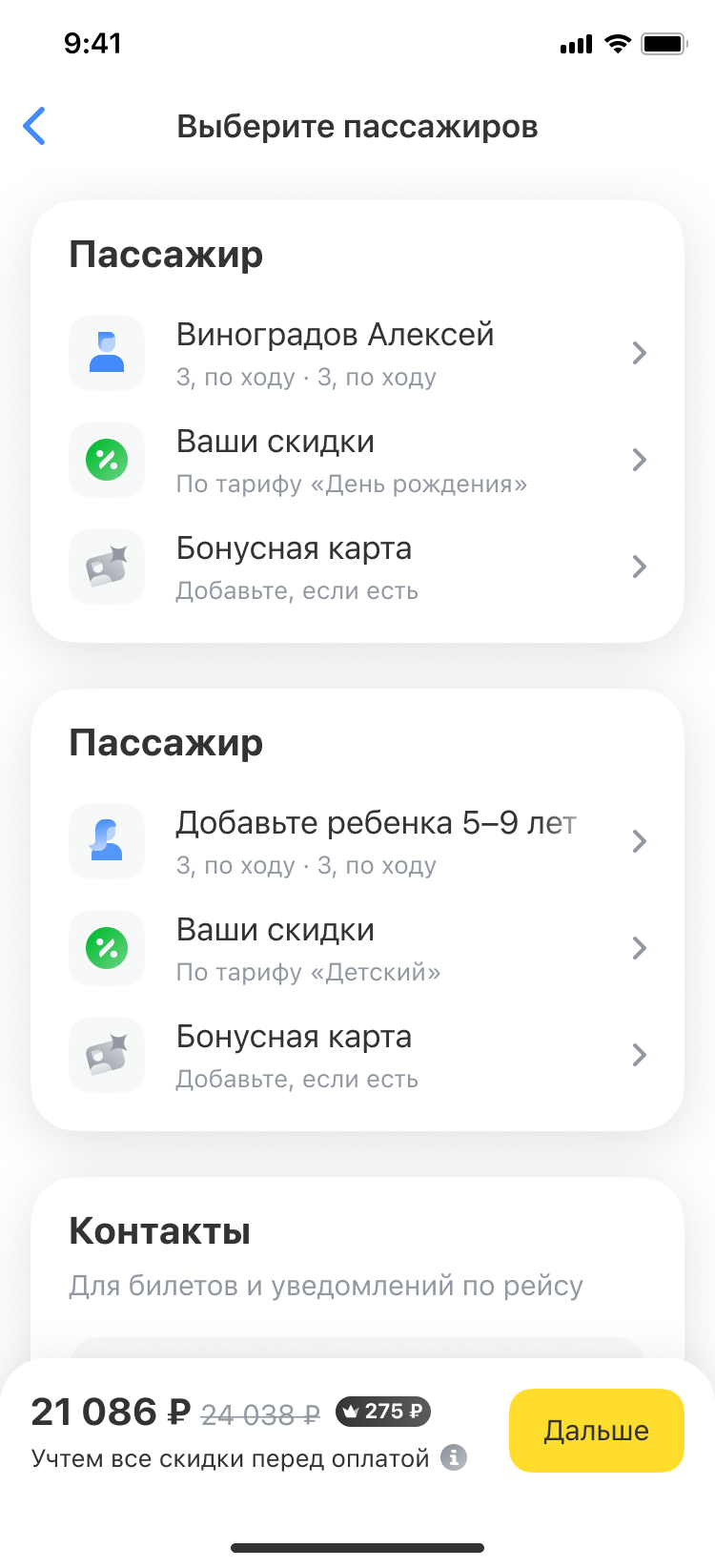
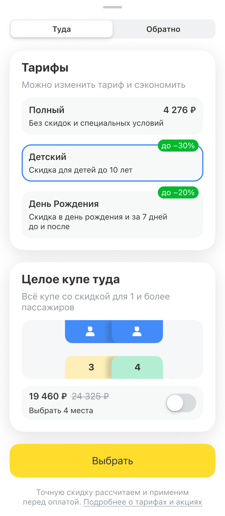
5. Consolidated tariffs and discounts in one place
Tariff information is most useful when users can compare options in the context of their booking.
I brought tariff and discount information closer together, helping users review available options and understand their conditions without having to piece together information from different parts of the flow.
Design intent: Make tariff comparison more straightforward and reduce the effort required to find the information needed for a decision.
6. Clarified discount status and price changes
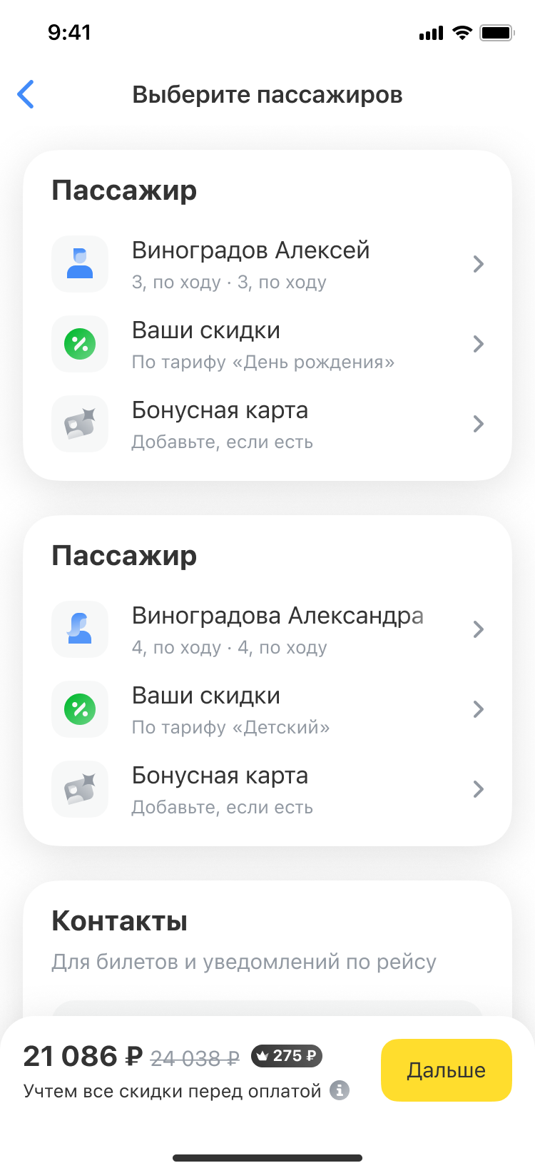
One of the most important parts of the redesign was communicating that discounts can be in different states.
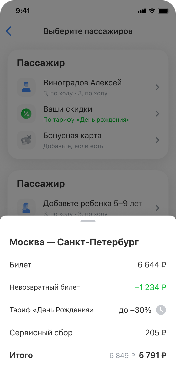
A discount may be available for selection, already applied, or awaiting the validation required to calculate its exact amount. These states have different implications for the user and should not be left open to interpretation.
I worked on making discount status and price changes easier to understand throughout the booking flow, including the transition from preliminary pricing to the final amount.
Design intent: Reduce uncertainty when the displayed price changes at different stages of the journey.
05. Validating the experience
To evaluate whether the redesigned flow communicated discount behavior clearly, I prepared prototypes and a usability-testing plan focused on the entire booking journey.
Instead of asking participants whether a screen looked understandable, the plan was built around realistic tasks and observable behavior.
What I wanted to learn
- Can users notice and interpret discount indicators in train search results?
- Can they identify seats eligible for a non-refundable tariff?
- Do they understand how the displayed discount relates to the ticket price?
- Can they find and compare tariffs for different passengers?
- Do they understand why some discounts affect the price immediately while others require document validation?
- Can they distinguish between discounts that have been applied and those that are still pending?
- Can they identify the final amount they are expected to pay?
Testing the full journey
- The prototype covered the key stages where users make decisions or interpret changes in price:
- Selecting trains for the outbound and return journeys.
- Choosing seats and interpreting discount badges.
- Reviewing ticket prices and applied discounts.
- Selecting passengers and appropriate tariffs.
- Checking discount statuses and price changes.
- Reviewing the final price before payment.
- A key principle was to avoid explaining the mechanics of the interface to participants. Their ability to discover and interpret the information independently was itself part of what needed to be tested.
- The central measure of success was whether users could explain which discounts applied, how they affected the price, and whether they expected the amount to change further — without additional guidance.
- [Add the actual research findings here once testing is complete: observed usability issues, changes made after testing, and any remaining uncertainties.]
06. Expected impact
The redesign was intended to improve both the user experience and the performance of the booking funnel.
For users
- Easier discovery and comparison of available discounts.
- Clearer understanding of tariff conditions.
- Better visibility into which discounts have been applied.
- Fewer surprises when the ticket price changes.
- Greater confidence in the final amount before payment.
For the product
- Fewer errors and abandoned decisions caused by unclear tariff information.
- Potential improvement in progression through the booking funnel and purchase conversion.
- Potential reduction in support requests and negative feedback related to discounts and final pricing.
These are the intended outcomes of the work, not measured results. To establish the actual impact, I would compare the relevant funnel metrics before and after release and combine them with usability-test findings and support feedback.
Potential metrics include:
- Conversion from train selection to successful purchase.
- Drop-off at tariff selection and passenger details.
- Checkout abandonment rate.
- Frequency of tariff changes during booking.
- Support contacts related to discounts and final ticket prices.
Overview
Train tariffs and discounts were one of the most complex parts of the railway booking journey in T-Bank Travel. Users had to navigate different discount conditions, understand which offers were available to them, and figure out how each tariff affected the final ticket price.
I redesigned the tariff experience to make discounts easier to discover, compare, and understand throughout the booking journey — from train search and seat selection to passenger details and checkout.
Results
This project reinforced that discount UX is not just about making savings more prominent. It is about helping users understand the relationship between eligibility, conditions, calculation, and the final price.
A percentage badge can attract attention, but it cannot answer every question a user has. A price can be technically correct at a particular stage, yet still feel unpredictable if the interface does not explain what happens next.
The most important design challenge was to make the booking process feel coherent even when the underlying pricing logic was not immediate or straightforward.
By treating tariffs as a journey-wide experience rather than a collection of separate screens, I aimed to give users a clearer path from discovering a discount to understanding the amount they would ultimately pay.
The core principle behind the redesign: users should not have to guess whether a discount applies, what it means, or when they will know the final price.
01. The challenge
Discounts were difficult to understand and compare
Tariffs affected multiple stages of the train booking flow, but the information users needed was spread across different screens and interactions.
The core problem was not simply that discounts were hard to find. Users also needed to understand whether a discount was available, whether it had already been applied, how much they would save, and when the exact amount would become clear.
This was especially challenging because the system supported two types of discounts:
- Calculable discounts — the price could be recalculated immediately, allowing users to see the effect of a tariff selection.
- Non-calculable discounts — the exact amount depended on passenger information and document validation, so the final discount could only be determined later in the booking flow.
As a result, the same action could produce different pricing behavior depending on the tariff. Without a clear explanation, a delayed price update could be interpreted as an error or as evidence that the discount had not been applied.
The main design question
How might we help users compare available tariffs, understand their discount status, and anticipate the final ticket price — even when the exact discount cannot be calculated immediately?
02. Defining the problem
I approached the redesign around three connected user needs.
Discoverability
Users need to notice available discounts and understand where and how they can select them.
Transparency
Users need to know which discounts are available, which have been applied, and which are still awaiting validation.
Predictability
Users need to understand how discounts affect the ticket price and when the amount shown becomes final.
These needs informed the central hypothesis behind the redesign:
Users will be able to understand the status of each discount and anticipate its impact on the final ticket price, even when the exact amount becomes available only after document validation.
03. Design strategy
Rather than treating tariffs as an isolated screen, I approached them as a continuous experience across the booking journey.
The redesign focused on six principles:
- Make discounts visible earlier in the journey.
- Help users distinguish eligible seats and tariff options.
- Show the financial benefit of a discount more clearly.
- Make tariff selection and switching easier to discover.
- Explain the status of discounts and changes in price.
- Bring tariff and discount information together where users make booking decisions.
The goal was to reduce the amount of interpretation users had to do themselves — without adding unnecessary steps or overwhelming them with information.
04. Key design decisions
1. Reduced disruptive overlays
I reconsidered the use of bottom sheets throughout the booking journey. Instead of repeatedly interrupting the main flow, I aimed to keep more relevant information visible in context.
Where overlays remained necessary, I redesigned them to give users more room to review the information and make a decision.
Design intent: Help users understand their options without losing context or feeling pulled away from the booking process.
2. Made non-refundable tickets visible earlier
Non-refundable options can offer a lower price, but users need to understand the conditions before choosing a seat.
I introduced a more visible way to identify seats available under the non-refundable tariff, using a discount-percentage badge on the seat map.
This created an important design challenge: the badge needed to communicate that the tariff was available for that particular seat, rather than imply that the displayed percentage was necessarily the exact amount the passenger would save.
Design intent: Make discounted options discoverable at the moment users choose their seats, while reducing ambiguity around the meaning of the badge.
3. Made savings more transparent
A discount percentage alone does not always help users understand the actual financial benefit. This is particularly true when the percentage represents a maximum possible discount rather than the amount a specific passenger will receive.
I focused on making the relationship between the original price and the discounted price clearer, so users could better understand how a tariff affected the cost of their ticket.
Design intent: Help users evaluate a discount in terms of its financial impact, rather than relying on a percentage in isolation.
4. Made tariff switching easier to discover
Users should not have to guess whether they can review or change a tariff after making an initial selection.
I improved the visibility of tariff-related actions and worked to make the relationship between a selected tariff, its conditions, and the resulting price easier to understand.
Design intent: Give users more confidence that they can review their choice and select a more suitable option before paying.
5. Consolidated tariffs and discounts in one place
Tariff information is most useful when users can compare options in the context of their booking.
I brought tariff and discount information closer together, helping users review available options and understand their conditions without having to piece together information from different parts of the flow.
Design intent: Make tariff comparison more straightforward and reduce the effort required to find the information needed for a decision.
6. Clarified discount status and price changes
One of the most important parts of the redesign was communicating that discounts can be in different states.
A discount may be available for selection, already applied, or awaiting the validation required to calculate its exact amount. These states have different implications for the user and should not be left open to interpretation.
I worked on making discount status and price changes easier to understand throughout the booking flow, including the transition from preliminary pricing to the final amount.
Design intent: Reduce uncertainty when the displayed price changes at different stages of the journey.
05. Validating the experience
To evaluate whether the redesigned flow communicated discount behavior clearly, I prepared prototypes and a usability-testing plan focused on the entire booking journey.
Instead of asking participants whether a screen looked understandable, the plan was built around realistic tasks and observable behavior.
What I wanted to learn
- Can users notice and interpret discount indicators in train search results?
- Can they identify seats eligible for a non-refundable tariff?
- Do they understand how the displayed discount relates to the ticket price?
- Can they find and compare tariffs for different passengers?
- Do they understand why some discounts affect the price immediately while others require document validation?
- Can they distinguish between discounts that have been applied and those that are still pending?
- Can they identify the final amount they are expected to pay?
Testing the full journey
- The prototype covered the key stages where users make decisions or interpret changes in price:
- Selecting trains for the outbound and return journeys.
- Choosing seats and interpreting discount badges.
- Reviewing ticket prices and applied discounts.
- Selecting passengers and appropriate tariffs.
- Checking discount statuses and price changes.
- Reviewing the final price before payment.
- A key principle was to avoid explaining the mechanics of the interface to participants. Their ability to discover and interpret the information independently was itself part of what needed to be tested.
- The central measure of success was whether users could explain which discounts applied, how they affected the price, and whether they expected the amount to change further — without additional guidance.
- [Add the actual research findings here once testing is complete: observed usability issues, changes made after testing, and any remaining uncertainties.]
06. Expected impact
The redesign was intended to improve both the user experience and the performance of the booking funnel.
For users
- Easier discovery and comparison of available discounts.
- Clearer understanding of tariff conditions.
- Better visibility into which discounts have been applied.
- Fewer surprises when the ticket price changes.
- Greater confidence in the final amount before payment.
For the product
- Fewer errors and abandoned decisions caused by unclear tariff information.
- Potential improvement in progression through the booking funnel and purchase conversion.
- Potential reduction in support requests and negative feedback related to discounts and final pricing.
These are the intended outcomes of the work, not measured results. To establish the actual impact, I would compare the relevant funnel metrics before and after release and combine them with usability-test findings and support feedback.
Potential metrics include:
- Conversion from train selection to successful purchase.
- Drop-off at tariff selection and passenger details.
- Checkout abandonment rate.
- Frequency of tariff changes during booking.
- Support contacts related to discounts and final ticket prices.